Find here a zip file that includes some base HTML, a readme.txt that will direct you to this page which has the instructions and examples for what needs to be accomplished.
Download files:
You can use any resources (except each other), including the internet to accomplish the task of making this website a responsive site to the specifications shown below.
Directions:
Convert this fixed layout site into a responsive site
- You are not to alter the original HTML in any way (e.g. adding classes, ids, etc.)
- You must use existing elements and their names in order to target elements.
- The only alteration that is acceptable is adding a viewport meta tag in the HTML and the charset meta tag. And if you are doing the bonus section, the addition of navigation is also acceptable.
- You will need to write your CSS mobile first
- You will need to write two media queries in your CSS. One for tablet and one for desktop
- You will need to make sure all images are flexible/adaptable. You will need to make sure your text is relative.
- You determine where to place the breakpoints for each layout based on your sense of design aesthetics
Re-Write your CSS to meet the following specifications:
Small Layout:
Your content must not become smaller than 320px
No image in the banner area
(look at the role to determine which one this is that I mean & compare the pictures)
The banner h2 is a grey background color bar with two rounded corners
(look at the picture to see which two are rounded)
1 column layout – do not remove/hide content.
footer text is centered
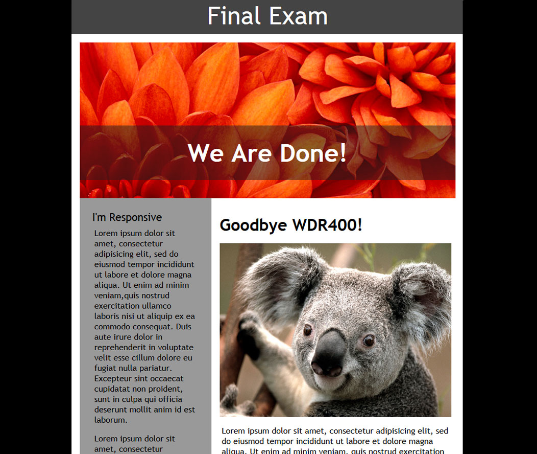
Medium Layout:
2 column layout
Koala image expands to fill the area
text flows below image
banner background image adjusts
headline in a box that is 50% transparent
footer text is left on the left side.
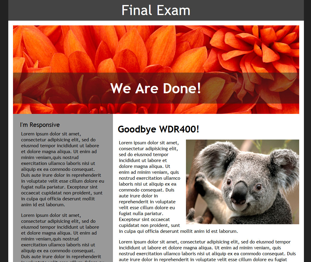
Large Layout:
Convert the fixed sizes
Layout is no wider than 1000px
Banner image adjusts as the layout flexes
Adjust padding and margins as needed
footer text is aligned to the right
Points will be taken off for not following all the instructions. Please use the image examples below for reference to help determine what is wanted for the layout and ask questions if you are unsure about anything. I know that the images are cut off at the footer, but you can see in the instructions above how to handle it at each size. The thumbnails below are cropped to some degree, so I suggest you click on them to see the full sized image to get a better idea.

Bonus Points
Create a responsive nav. Depending on the work done you could earn up to 3 additional bonus points. You are allowed to create/write this HTML since it is not included in the base file.